
Maybe It’s Not Marketing’s Fault
How to use data to identify the real culprits inhibiting encounter volume growth.
// By George Danner //
 I am not a marketer, but I have listened to conversations among our marketing team members and their clients about the difficulty of the marketing role in health care. When patient volumes and/or market share are down, the organization’s reflex is to push a single lever — marketing — in hopes of re-establishing normal business activity that the system depends upon for survival.
“If we had more billboards…”
“Competitor X is marketing more than we are…”
It’s not an unreasonable reaction, but often the picture is more complicated.
A solution to all of this is computer simulation modeling.
Sound, data-driven strategy starts with a realistic model of consumers coupled with the structure of the marketing pipeline. This creates a laboratory whereby a range of marketing actions can be tested, and the outcome, in the form of a set of KPIs, can be shown.
Veterans of business structure analysis recognize that the best outcome of any system arises from many small, surgical doses of improvement at targeted points rather than large, across-the-board interventions. Don’t like that outcome? Try another experiment with a different set of actions. And another, then another.
As you’ll see, a good model can settle debates about what’s working — and what’s not.
An important point to note here is that the model does not have to be perfectly accurate. The standard for usefulness is realism. The model should produce realistic outcomes that assess, directionally, action X versus action Y.
Good models generate insight, not necessarily a perfect prediction of the future.
A visual diagram serves to expose all of the “plumbing” that occurs between the addressable market of health consumers and the ultimate encounter with a provider, as well as all of the related downstream and parallel encounters.
We recommend setting the data aside for the moment and just getting the structure right on paper.
A pipeline is the best physical metaphor for movement of a consumer through the pathway. The most important step here is to commit the journey to a graphic depiction and use clear language to describe objects and concepts. The arrangement should be left-to-right, with average time intervals from one step to another clearly marked.
Carefully examine the blueprint for clues that would make the flow better or worse. These are the kinds of questions you should ask before any numerical data is introduced into the exercise:
- Are there too few resources (human, technology, or otherwise) in marketing, access, or operations, creating an imbalance?
- Are there silos between one step and the next downstream step?
- What might cause dramatic changes in Key Performance Indicators (KPIs) such as market share vs. payer mix?
- What potential bottlenecks in the system (e.g., call length, wait times) that require data?
- In what areas would you like to benchmark (internal/external)?
Now let’s discuss how adding data can enrich the conversation.
Defining the Market
As we create these diagrams for our clients, the very first topic of debate is the Total Available Market (TAM) on the far-lefthand side.
- How big is it in total?
- What kinds of consumers are contained there?
Different opinions emerge, including payer type, geographic boundaries, and even service-line distinctions. In some cases, we discover that TAM had never actually been measured systematically.
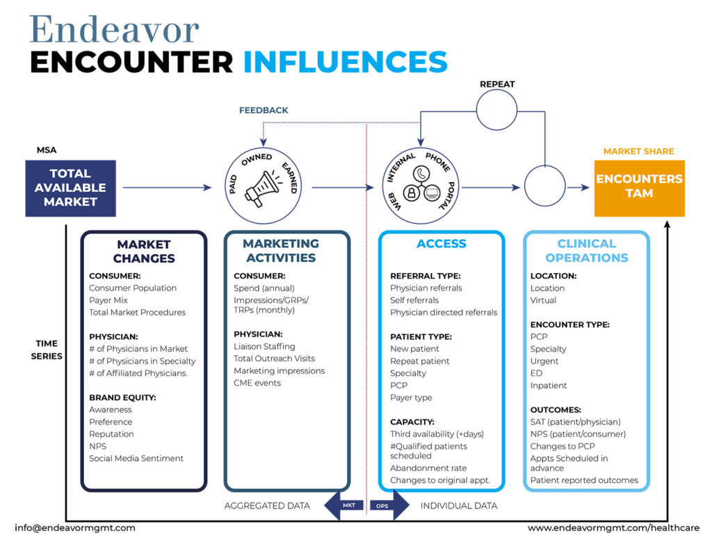
While TAM measurement will never be an exact science, putting a degree of objectivity in its measurement is a highly worthwhile investment. The exercise of creating a diagram of the pipe forces us to make this happen. Download the diagram here.
What Influences a Consumer?
The second grand debate typically centers on influences on consumer decision-making. Consumers are not monolithic concepts but rather human beings with widely varying properties, making them predisposed to influences, whether marketing or physician, at each step.
Therefore, there is not one pipe but rather a splinter of many pipes holding different consumer flows that at times intersect with one another.
We use various depictions of the same pipe flow to show the delineations of consumers, especially where a different action from other groupings is applied. Case in point: A consumer on their seventh follow-up visit for a chronic condition is far different from a never-seen-before expectant mother. Marketers know these nuances well. What they lack is an analytical forum to test a range of actions (more on this later).
Benefits of Visualization
Diagramming the “calculus” of marketing shows the rest of the organization outside of marketing how it works. Much like an owner’s manual for a car explains the functions of various operating units of the car, these diagrams show, in layman’s language, the gears that drive marketing forward, and the logic of why policies and processes are arranged in a certain way. We have found these diagrams are a helpful means to an internal dialogue between marketing and the senior management of the system.
Data Supports Decision-Making
The discussion, prompted by the creation of the blueprint, ultimately leads to the debate that we all want to have: What is the best way to move an individual consumer or segment from one step in the pipe to the next step in the pipe, ultimately toward an encounter?
While many ideas are brought forward and even in some cases data attached to those assertions, what’s noteworthy are the various tradeoffs inherent in the mix of actions considered — doing A at the expense of less of B and vice versa. Human brains are excellent at many things, but one area where brains are deficient is in evaluating optimal tradeoffs. This is why strategy meetings often devolve into dysfunctional fights between the “A” crowd versus the “B” crowd (and not just in health care either).
A good model can settle these debates. These are just a few of the dozens of counterintuitive findings that a model can reveal:
- Physician outreach can be more impactful (sometimes 10X) than various advertising channels
- Declines in encounter volume might not be caused by market share decline; rather, aggregate market encounters (i.e., deferred care)
- While marketing fills the top of funnel, appointment availability over time inhibits realized encounters
- Overweighting traditional tactics over digital can result in missed market share goals.
Don’t Let Data Quality Hold You Back
It is very common in our work for organizations to conclude that they have insufficient data to create such a model. And even if they did, the quality of their data is so poor that any useful output of the model is illusive.
In our decades of building models for all kinds of organizations, we have found that this simplistic conclusion is most often wrong. Yes, every organization struggles with accurate data. Yes, this data has all sorts of problems from missing values to Babel-like formatting.
The good news is that the tools for dealing with problematic data have progressed just as the focus on being more analytical has permeated every firm on the planet. One should not assume that the state of data is an inhibitor to model building, but rather just a headwind among many in the journey to create an analysis that makes everything it touches better, faster, and cheaper.
We are not recommending any organization to throw out its traditional methods for devising marketing strategies. We are fans of knowledge and experience that has been gained over decades of successfully growing patient volumes, even during difficult periods of history.
But we suggest that when great human minds are coupled with analytics and data, the result could be a super-additive effect, as in 1 + 1 = 3. These concepts could not be timelier in an age where our marketing teams are being asked to outperform, while the availability of data and the tools of analysis have never been greater.
How can marketers take quick action? Here are the key steps:
- Link to the corporate strategy: Identify the encounter volume growth information that’s most critical.
- Capture the right questions to ask: Start with a facilitated session to discuss the problem and context; the team can build a hypothesis and discuss the data variables that should be included in the analysis.
- Use a diagram: Frame thinking using a visual, diagrammed approach. Visualization such as a flow diagram draws out meaningful relationships over time to paint a complete picture.
- Establish buy-in: Create alignment among stakeholders using the diagram. This is a critical part of the activity before moving into the arduous task of gathering, formatting, and cleansing data.
- Engage subject matter experts beyond marketing (e.g., access centers, clinical operations): They can serve to validate the model, ensuring the numbers make sense.
- Put the model into action: Inform strategic decisions and develop simulations. This is where the hard work pays off, and you’re able to truly determine the relative impact of increasing marketing investments.
George Danner is chief data scientist at Endeavor Management, a firm that enables organizations to move confidently through uncertainty. He has published several books, including Profit from Science and The Executive’s How-To Guide to Automation. George works with clients to use data to improve business performance by using data models for problem-solving, optimization, and forecasting.